Image Editing
These photos were created in both Canva and Inkscape
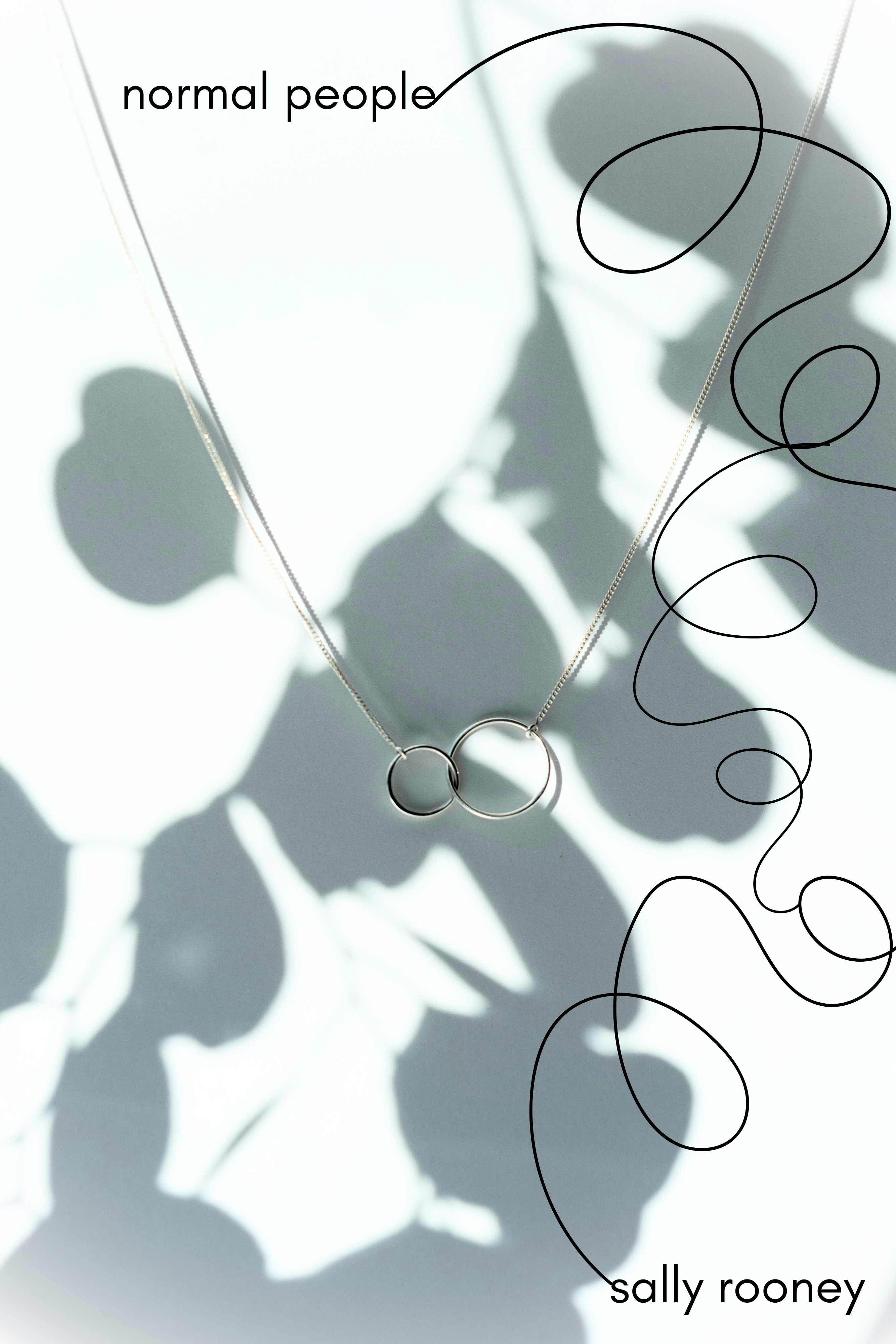
The image of the necklace was found through the free picture site Pexels which often has high resolution photos with natural lighting and a less stock-y feel. The necklace serves as a symbol in the story: the male main character, Connell, wears this chain notably in his description which serves to distinguish his blue-collar working class background from his love interest, Marianne. I adjusted the brightness, shadows, whites, and blacks on the background, as well as adding a reverse vignette. I felt the simplicity of the chain combined with the harsh shadow silhouette of the plant captured their back-and-forth relationship and how one of them always feels hidden or inadequate. I added and adjusted the swirling lines to capture their inability to commit for a long period of time to one another, constantly chasing each other through their lives and being both the victims and perpetrators of miscommunication.
I chose to go with a sans-serif font in all lower-case as well to represent their quiet but constant presence in each other's lives, as well as their inability to love themselves the way they love each other.
I debated putting the line in a color, and ultimately decided against it. I felt one pop of a single color may lead to its relevance as a symbol.
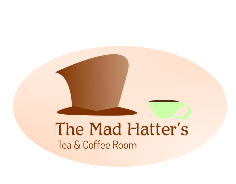
I selected two fonts for design purposes: the first font has a more whimsical vibe without impeding the ability to read it, and if hypothetical customers shortened the name to “The Mad Hatter's” it would still be obvious what the business is. I wanted to keep it simple so I only added a cup of coffee for the quick visual, assuming the Mad Hatter hat would also convey the tea portion. I rounded the crop since there aren't really any angles within the photo; I figured if all the rounded edges were surrounded by 4 right angles, it would look choppy and off visually.